Improve WooCommerce Conversions
Have you ever wondered why despite having huge traffic your e-commerce store is unable to make it big in terms of sales?
The answer is that most of your traffic remains traffic without getting converted into sales or in other words, people are visiting your stores but not buying anything. It’s a common issue most eCommerce stores are struggling to overcome.
If you are running a WooCommerce store and looking forward to converting all your traffic into sales, I have got some great tips for you.
Read ahead and find out.
What are WooCommerce Conversions?
Before moving on to learn about how you can improve the conversions of your WooCommerce store, you need to know what the term “WooCommerce conversion” exactly means.
Most of you might have an idea that it’s about making more sales for your store. It is indeed the biggest part of it, but there is more to it. Simply put, WooCommerce conversion is all about making sure that every visit that takes place in your store is converted into the desired action.
The desired action can be anything from your store visitors subscribing to your email newsletters, sharing your products via social media, submitting forms on your website, to making purchases from your store. The percentage of visits that resulted in these actions is termed as the conversion rate of your WooCommerce store.
Now that you have clarity over what WooCommerce conversions are, let’s get to the most interesting part of the article – finding ways to improve your WooCommerce store’s conversions.
Easy and Efficient Ways to Improve WooCommerce Conversions
As I mentioned earlier, WooCommerce conversions is a pretty broad concept. There are certain elements in your store that might need to be improved to boost your store’s overall conversion rate.
Taking this into account, let’s break WooCommerce conversions into three components. This will also be helpful for you when you start applying conversion techniques to your store.
- WooCommerce landing page conversion
- WooCommerce product page conversion
- WooCommerce checkout page conversion
Let’s find out how you can optimize each of these pages for yielding better conversions for your store.
WooCommerce Landing Page Conversions
Landing pages are one of the most important parts of your website and can improve WooCommerce conversions, but for most of you, it is a bit cloudy concept as well.
According to the definition given for landing pages by Wikipedia, “It is a single web page that appears in response to clicking on a search engine optimized search result, marketing promotion, marketing email, or an online advertisement”.
Read the “Guide to Grow Your Business with Email Marketing”
This very definition goes against the popular notion given by most marketing and eCommerce blogs that landing page is a dedicated page on a website that shows its visitors well-crafted marketing messages, offers, and deals that make them hook to the website.
To a great extent, the marketer’s version of landing pages holds true for certain niches of websites. But when it comes to an eCommerce website, you need to look at it in a different light.
For a WooCommerce store, you may have to consider all of its pages as landing pages and optimize them accordingly. This makes sure that wherever a visitor lands on your website, they will get the right message that would prompt them to take the desired action.
For most WooCommerce stores, their prominent landing pages would be its product pages. But there can be other pages too. To get clarity on that you can make use of the Google analytics tool and get a list of the most frequented landing pages in your store by navigating to
Behavior> site content > Landing pages within it.
Now that you have a full list of such pages you can start optimizing them for better conversions.
As there is a section solely dedicated to improving the product page conversion, let’s learn about the conversion of non-product landing pages in your store such as blogs, FAQ pages, docs, support resources, etc.
→ Give higher visibility to the main navigation menu
Providing higher visibility to the main navigation menu of your website will be a great practice to increase conversions of your landing pages. This way wherever your visitors land on your website, they will not find it hard to find their way around your WooCommerce store.
→ Provide easily accessible information about your brand and products
Displaying information of unique value about your brand and products on all landing pages either on their footer or by using an attention-grabbing graphic in a sidebar that links to an “about us” page will truly create a great impression of your store among your visitors. You can later use it to lead them to make purchases from your store.
WooCommerce Product Page Conversions
Product pages are the heart and soul of a WooCommerce store. Let’s find out what are the ways to improve the product page conversions of your WooCommerce store.
→ Make it easy to locate the right products
There is nothing more appealing to your potential customers than giving them a faster and easy shopping experience on your website. The product page deserves greater attention as it holds a higher probability of conversion.
The more time your shoppers take to find the right product in your store, the less likely they are to convert.
By making a few simple improvements to your product page, you can make it easier for your customers to find what they want in a few seconds. Some of the best practices include adding live search and filters, improved product navigation (that helps find a product based on its category, price range, color, size, or any other available product attribute), product comparisons, etc.
→ Create a sense of urgency
This would be a great solution to reduce cart abandonment and increase your sales. It’s like giving a nudge to shoppers who hesitate or postpone their purchases. There are several ways you can awake this feeling inside your potential customers’ minds.
Running a limited period offers is one of the best among them. When offers are tempting and come with a deadline customers would be unable to resist the urge to purchase aka the FOMO (fear of missing out). Thus they purchase in time to avail of the offer.
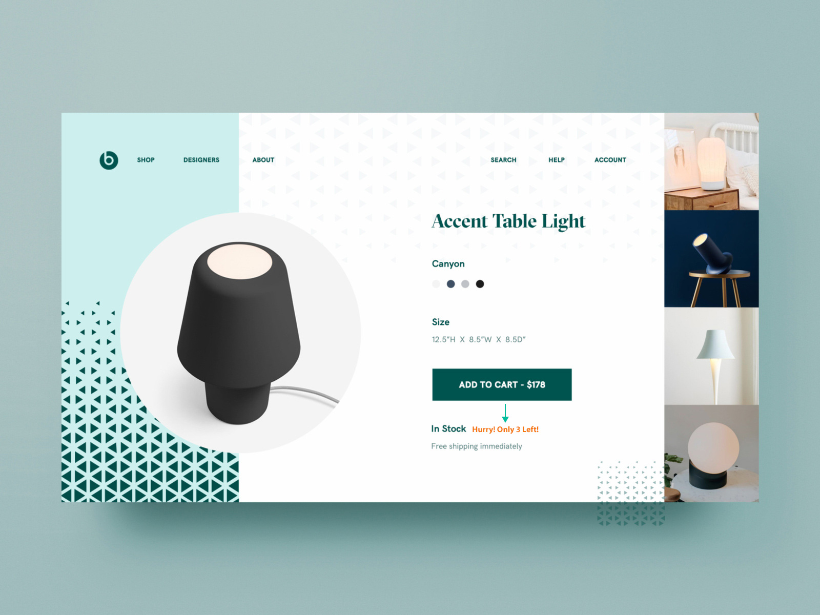
Offers aren’t the only way to induce the FOMO effect in your customers, you can try the scarcity effect as well. Using this effect you can persuade your customers to make purchases by displaying low stock availability or by showing the number of items left in the stock.
→ Display a product comparison table
Displaying a product comparison table that compares your products to that of your competitors would be of great help for your shoppers to make quick decisions without leaving your website. But what if your shoppers loved your competitors’ products more than yours and went for it after going through the comparison table?
That would be a blunder!
To avoid this you need to craft the comparison table in a way that favors both your customers and your store. How do you do it?
The two most important things that people consider before buying a product are its price and features/quality. If some of your products are expensive than that of your competitors, you should focus on putting your prominent features as the most noticeable part of your comparison table which will give your products an edge with your competitors.
→ Use high-quality product images and videos
The major content of a product page is product images. Unlike brick and mortar stores where customers can purchase products after seeing and touching them, people have to rely on product images and videos in the case of online stores. That’s why it becomes so important to have high-quality product images and videos in your store.
3D Image viewing
To give your shoppers a better idea of your products you need to use a high-resolution image having a great zoom feature. Most shoppers love product images having features such as interactive zoom or pan.
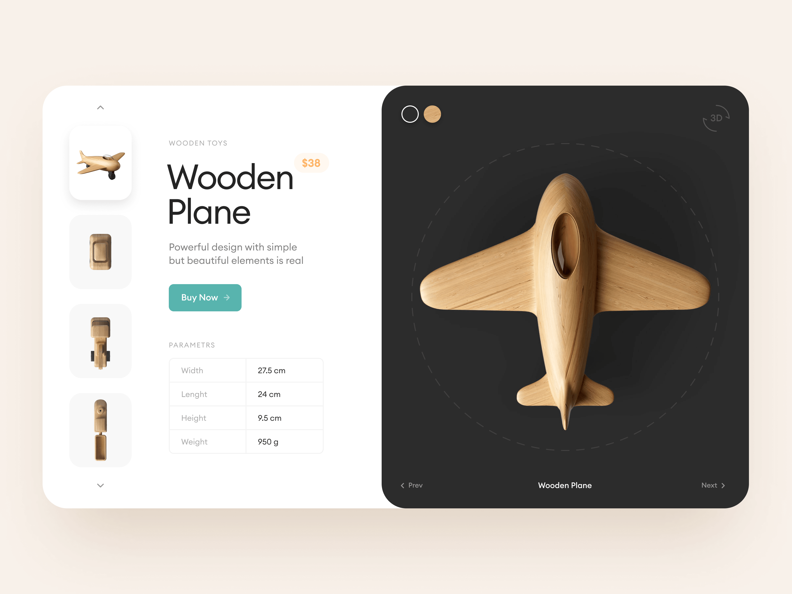
It is also a great option to include images giving a 360° product view or 3D image viewing. These images allow you to display different dimensions, angles, and perspectives of the product that help your customers make quick decisions on whether or not to purchase the product. Apart from that, incorporating such latest technologies into your store will also make your store look professional to your store visitors.
→ Add a unique selling proposition (USP)
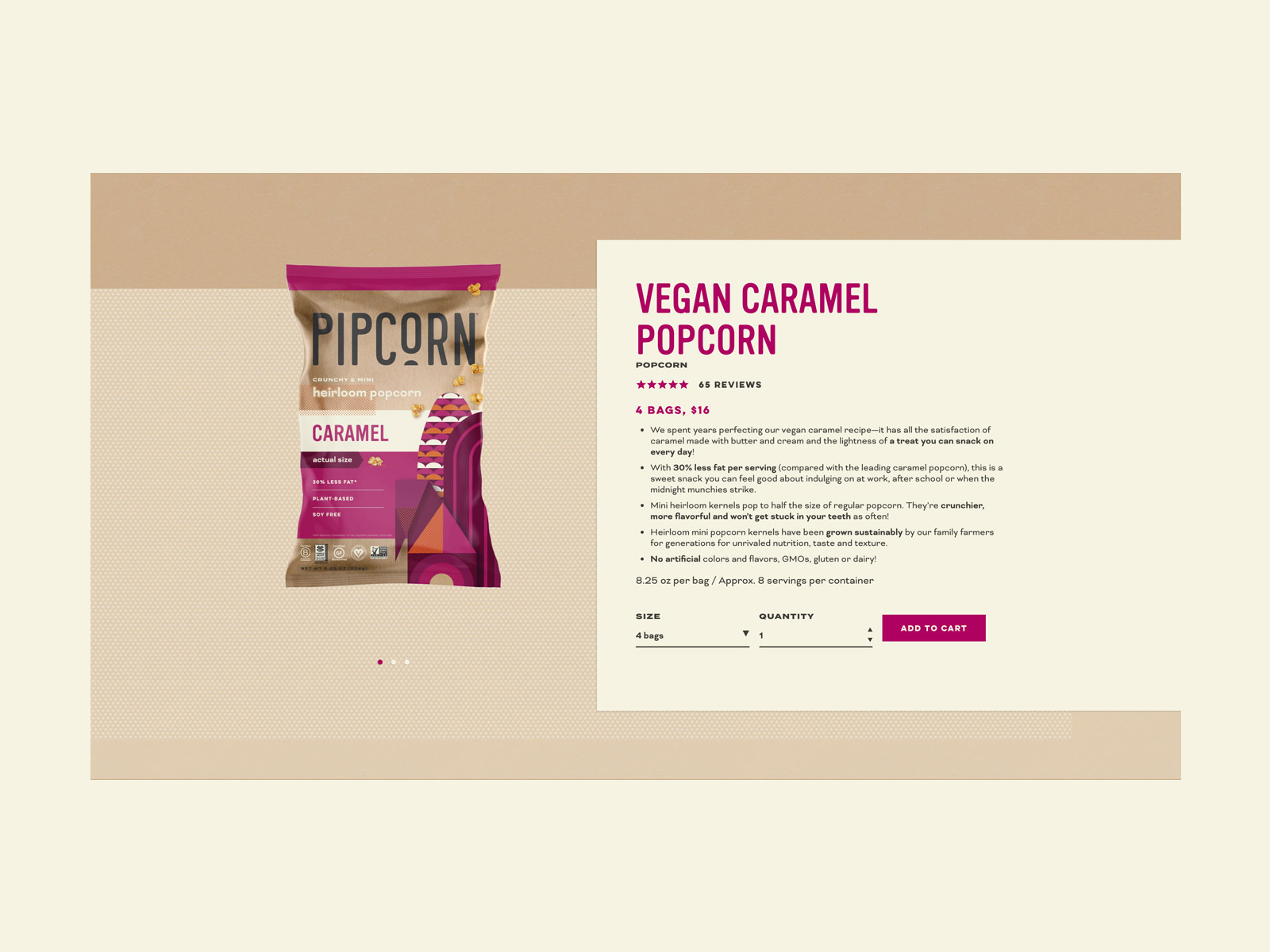
USP’s are an integral part of promoting your products. It informs your potential customers of the unique qualities or benefits that your product or brand possesses that make it a superior option to your competitors’.
Crafting such a unique copy might seem a bit intimidating at first but once you get a hang of it, you will know the difference it can make to your website’s conversions. To create a great USP all you have to do is keep some points in mind.
First thing is to have a precise idea of what differentiates your product and brand from others’, then research the USP’s of your competitors and find the gaps in it, now take a deep look at your customer’s needs and see if your products satisfy them and finally compile and process these data to create an excellent USP for each of your products.
→ Add easily visible call to action buttons (CTA)
Call to action buttons are a quick way to boost conversions as it prompts your shop visitor to take action by clicking on the button. But to ensure conversions you need to create a compelling call to action button. What goes into the creation of high-converting call to action buttons? Let’s find out.
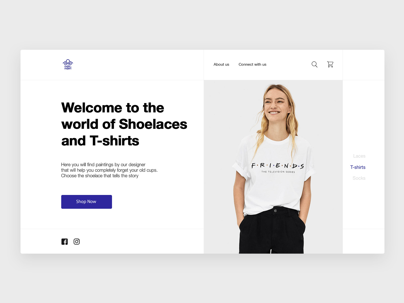
Call to action buttons need to be highly visible to your store visitors to ensure and improve WooCommerce conversions. Higher visibility can be achieved by a proper combination of some factors such as CTA placement, shape, color, font, graphics, etc.

WooCommerce Checkout Page Conversion
Checkout pages are the end stage of a buyer’s journey. Thus it has a great impact on your store’s conversions. A study conducted by Baymard Institute on reasons for cart abandonment reveals that most of the cart abandonment occurs due to poor checkout practices followed by eCommerce stores. Too long or complicated checkout processes are one of the major reasons for shoppers leaving your store without making purchases.
Reasons for Abandonments During Checkout
4,560 responses – US adults – 2020 – © baymard.com/research
The least, fixing all the above-mentioned issues will help a long way in securing sales by increasing conversions of your WooCommerce store.
→ Hide unnecessary fields
The number one reason that makes checkout processes long and complicated is unnecessary checkout fields. It is estimated that an average checkout flow has 14.88 form fields which are twice as many as necessary.
Shoppers feel intimidated about having to fill all the fields to proceed, so they decide to end the transaction altogether. You can minimize the checkout steps to as many as 6 to 8 by making a few simple tweaks on your checkout page.
Some of the most effective techniques are using a single full name field. This allows you to eliminate fields asking for a first name, last name, and a middle name. You can use a shipping address as billing address by default as most customers have the same billing and shipping address. The major reason behind including these fields separately is for ensuring the credibility of payment/credit card information and thus to reduce risks.
But if your payment provider is capable of handling these security checks, you can certainly remove these extra fields. Collapsing address line-2 and company name behind a link will also help reduce steps as these fields will only appear once the shopper clicks on the relevant links.
→ Include multiple payment options
Providing multiple and most popular payment options on your checkout page can help save a great number of sales in your store.
Reasons for Abandonments During Checkout
4,560 responses – US adults – 2020 – © baymard.com/research
As per the data published by Baymard, 6% of shoppers abandoned their carts as there weren’t enough payment methods available and another 4% did the same as their credit cards were declined at checkout.
To avoid this, you need to find a payment gateway that supports as many popular payment options as possible.
→ Remove checkout page distractions
Keeping your checkout clear from distractions goes a long way in keeping your shoppers focused on completing the checkout process. When you fill your checkout page with clickable buttons that lead them to social media pages, products, etc., they are most likely to click on them and leave the checkout page.
Coupons are another important source of distractions on WooCommerce checkout pages. Once they see the empty coupon code field they will leave the page in search of coupons and might forget to come back and finish the pending purchase. To avoid this you can make use of WebToffee’s Smart Coupons for WooCommerce an add-on which will automatically apply coupons to eligible customers on the checkout page.
→ An auto-detect country using IP address
When you sell internationally, you are going to have to change your currency, payment options, shipping options, etc., according to the country of your potential customer. There is also another possibility that you have a selling or shipping restriction to certain countries.
Thus if you are able to auto-detect your shopper’s country through their IP address, you will be able to let them know beforehand that you won’t be able to sell or ship to them and prevent them from wasting their time filling in those fields. This would avoid the user feeling disappointed at your store’s user experience.
Auto-detecting of address based on zip code is also helpful to avoid making shipping errors like sending items to the wrong address thereby delaying the delivery and causing a bad impression on your service and company.
→ Build trust with security and trust seals
Credit card frauds and other security threats have become common incidents nowadays. This has made shoppers think twice before entering their card or bank details while making a transaction. Shoppers are ever more aware of the security standards that they should look out for in a website/online store to make sure they are trustworthy.
Thus to address your shoppers’ security concerns, you need to employ powerful security measures at your store and reassure your potential customers about the measures that you have taken by highlighting them in your store. You can add trust badges and security seals to your checkout page to bring that effect.
This will allow your shoppers to enter their financial information and complete the checkout without any worries.
Conclusion
All the above points are indeed excellent ways to improve your WooCommerce store’s conversions. But these aren’t the final word for it. You can keep coming up with new ideas and experimenting with them in your store to see better and lasting results.
[et_bloom_inline optin_id=optin_1]

